Author: wpadmin

  • Crafting Captivating Headlines: Your awesome post title goes here

    Crafting Captivating Headlines: Your awesome post title goes here

    Engaging Introductions: Capturing Your Audience’s Interest

    The initial impression your blog post makes is crucial, and that’s where your introduction comes into play. Hook your readers with a captivating opening that sparks curiosity or emotion. Address their pain points or questions to establish a connection. Outline the purpose of your post and give a sneak peek into what they can expect. A well-crafted introduction sets the tone for an immersive reading experience.

    Crafting Informative and Cohesive Body Content

    Within the body of your blog post lies the heart of your message. Break down your content into coherent sections, each with a clear heading that guides readers through the narrative. Dive deep into each subtopic, providing valuable insights, data, and relatable examples. Maintain a logical flow between paragraphs using transitions, ensuring that each point naturally progresses to the next. By structuring your body content effectively, you keep readers engaged and eager to learn more.

    Powerful Closures: Leaving a Lasting Impression

    Concluding your blog post isn’t just about wrapping things up – it’s your final opportunity to leave a strong impact. Summarize the key takeaways from your post, reinforcing your main points. If relevant, provide actionable solutions or thought-provoking questions to keep readers thinking beyond the post. Encourage engagement by inviting comments, questions, or sharing. A well-crafted conclusion should linger in your readers’ minds, inspiring them to explore further or apply what they’ve learned.

  • The Art of Drawing Readers In: Your attractive post title goes here

    The Art of Drawing Readers In: Your attractive post title goes here

    Engaging Introductions: Capturing Your Audience’s Interest

    The initial impression your blog post makes is crucial, and that’s where your introduction comes into play. Hook your readers with a captivating opening that sparks curiosity or emotion. Address their pain points or questions to establish a connection. Outline the purpose of your post and give a sneak peek into what they can expect. A well-crafted introduction sets the tone for an immersive reading experience.

    Crafting Informative and Cohesive Body Content

    Within the body of your blog post lies the heart of your message. Break down your content into coherent sections, each with a clear heading that guides readers through the narrative. Dive deep into each subtopic, providing valuable insights, data, and relatable examples. Maintain a logical flow between paragraphs using transitions, ensuring that each point naturally progresses to the next. By structuring your body content effectively, you keep readers engaged and eager to learn more.

    Powerful Closures: Leaving a Lasting Impression

    Concluding your blog post isn’t just about wrapping things up – it’s your final opportunity to leave a strong impact. Summarize the key takeaways from your post, reinforcing your main points. If relevant, provide actionable solutions or thought-provoking questions to keep readers thinking beyond the post. Encourage engagement by inviting comments, questions, or sharing. A well-crafted conclusion should linger in your readers’ minds, inspiring them to explore further or apply what they’ve learned.

  • Mastering the First Impression: Your intriguing post title goes here

    Mastering the First Impression: Your intriguing post title goes here

    Engaging Introductions: Capturing Your Audience’s Interest

    The initial impression your blog post makes is crucial, and that’s where your introduction comes into play. Hook your readers with a captivating opening that sparks curiosity or emotion. Address their pain points or questions to establish a connection. Outline the purpose of your post and give a sneak peek into what they can expect. A well-crafted introduction sets the tone for an immersive reading experience.

    Crafting Informative and Cohesive Body Content

    Within the body of your blog post lies the heart of your message. Break down your content into coherent sections, each with a clear heading that guides readers through the narrative. Dive deep into each subtopic, providing valuable insights, data, and relatable examples. Maintain a logical flow between paragraphs using transitions, ensuring that each point naturally progresses to the next. By structuring your body content effectively, you keep readers engaged and eager to learn more.

    Powerful Closures: Leaving a Lasting Impression

    Concluding your blog post isn’t just about wrapping things up – it’s your final opportunity to leave a strong impact. Summarize the key takeaways from your post, reinforcing your main points. If relevant, provide actionable solutions or thought-provoking questions to keep readers thinking beyond the post. Encourage engagement by inviting comments, questions, or sharing. A well-crafted conclusion should linger in your readers’ minds, inspiring them to explore further or apply what they’ve learned.

  • Reading Between the Lines: How The InQueery Turns Curiosity Into Research

    Reading Between the Lines: How The InQueery Turns Curiosity Into Research

    Why we exist The InQueery is an image-led online magazine built for people who want more than hot takes. We publish stories that start with a question, follow the evidence, and come back with something you can use: context, language, and a clearer view of what’s changing. “Curiosity is a method.” What we mean by “research” We use “research” in the broad, practical sense—reading widely, interviewing thoughtfully, and checking claims against lived experience and credible sources. Our goal isn’t to sound academic; it’s to be accurate, fair, and specific.
    • We define terms so conversations don’t collapse into confusion.
    • We trace origins—where an idea came from, who benefits, and what’s been left out.
    • We show our work by naming the context behind a conclusion.
    How to read The InQueery (and get more out of it) If you’re new here, try this approach:
    1. Start with the images. We choose photography that sets the emotional temperature of a piece—then we earn it with reporting.
    2. Look for the question. Every article is built around a specific “what’s really going on?”
    3. Keep an eye on the language. When a word is doing too much work, we slow down and clarify it.
    4. Follow the thread. Our stories are designed to connect—one article should lead you to the next question.
    What you’ll find in our pages We publish magazine-style features, interviews, and explainers that treat LGBTQ+ life as expansive—culture, politics, work, science, art, and the everyday. A small invitation If you like your reading clean, visual, and grounded, you’re in the right place. Start with a feature that catches your eye, then subscribe so you don’t miss the next inquiry.
  • Lotions and Potions

    Our new serum for the community. Read in bio 🧴🧪

    Reporting and illusgaytion by Dustin Sohn @dsiutnshon

  • Queer Roots

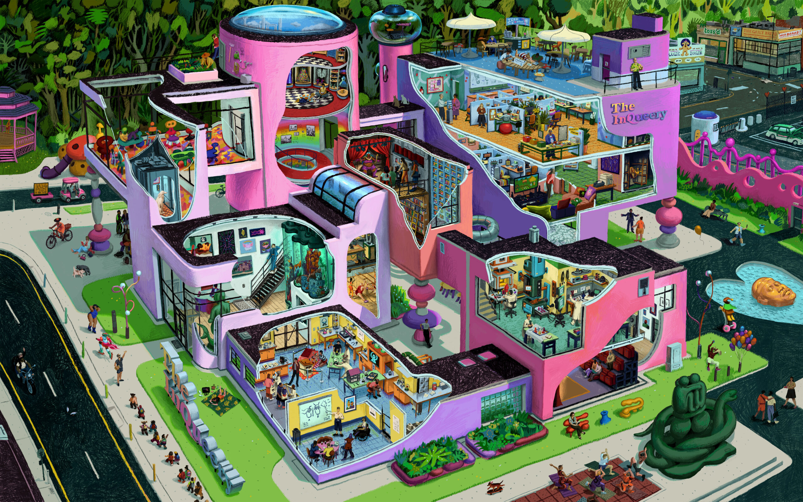
    As this year comes to a close, we’re once again taking a moment to reflect on how our little research corporation has grown. We’ve been hard at work to not only uncover upcoming queer trends, but to preserve our hard-hitting research for posterity in uncertain times. In the past year, we formed a committee to nominate up-and-coming gay sounds, developed a guide to joining queer sports leagues, redesigned our company uniforms to include iconic leather jackets, and crafted a diplomatic treaty with a group of merpeople. We also strengthened our brand partnerships this year, including collaborating on a series of salad recipes with Sweetgreen, creating a queer-focused workout app for Nike, and embarking on a business plan that would upgrade Zenni Optical to more than just a Warby Parker wannabe. Research into the “emotional support gay” archetype revealed a whole subculture of such helpers, and initial studies of the digital Cloud suggest that it may be a homophobic assault on queer analog devices. We touched on decorating trends, designer dogs, and queer modes of vacationing. Most crucially, we returned to our pioneering research on queer caffeination and were the first to report on the “flaming” nature of drinking hot coffee in the summer months.

    With these kinds of breakthroughs in the field of queer trend forecasting and analysis, it’s apparent that our investigaytors are well credentialed with deep reserves of knowledge. This comes as no surprise, as our team has devoted their lives to this study, going all the way back to their childhoods. In this season of reflection, our writers and illusgaytors are sharing their “queer roots,” their earliest queer fixations and identity shapers.

    Part 1 of 5. Story continues in the comments.

    @brianbritigan – Disney’s Hercules. When I was in elementary school I stayed home sick and watched the VHS on repeat for 48 hours straight, and I’m still sometimes surprised that this movie actually exists and is not just an elaborate fever dream concocted by my little gay eight-year-old brain.

    @annelisecapossela – Barbies. Woefully outdated hand-me-downs from my cousins which I lovingly “fixed” with buzzcuts, heavy eyeshadow, and hand-sewn tube tops and camo pants (yes, they were cargo).

    @westonweiart – Card Captor Sakura. When I was in primary school, every night after dinner I sat in front of the TV waiting to see the newest episodes of the Japanese animated show. It inspired me to create my own magical comics. I was chasing the love.

    @jackx.zhou – Sakura’s Clow Card. As a boy who was fond of sorcery, the cards from Cardcaptor Sakura were the most prized items among my collection. A deep bond was formed between myself and a girl who had the Clow Wand. We came together to practice magic, followed by a Daidouji-styled tea party.

    @stephanierudedoggie – Fried Green Tomatoes. This 90s classic was on heavy rotation in my family’s VHS player, but I’m pretty sure the thinly veiled queer subtext went right over my Midwestern parents’ heads. Mary Stuart Masterson plays an iconic badass “tomboy” who is clearly meant to be with Mary-Louise Parker. I was also fascinated by a scene in which Kathy Bates goes to a women’s sexuality workshop where the participants are meant to lie back in BarcaLoungers and examine their pussies with hand mirrors—who hasn’t been there?

    @kozatek – Holographic Pokemon Cards. These pieces of ‘queer currency’ gave me the playground prowess to dominate the str8 kids into showing some goddamn respect. “You want to gaze upon my first edition Charizard? First, bow down, bitch.”

    @aarontheillustrator – ‘Charles,’ the little blue Mini Cooper. My queer life started with that vehicle. I always had to pray he would start. Even when he got vandalized with slurs, I never felt more proud than when I had everyone I loved crammed into the back of that tiny, gay car.

    @robwilsonwork – Hugo puppet. This doll, known as a Man of a Thousand Faces, came with all kinds of accessories—plastic noses, chins, beards and glasses. But he became a magic dancer once I put a wig on him and wrapped him in a makeshift dress.

    @david_odyssey – Buffy the Vampire Slayer DVD box sets. Prized above all else in my childhood bedroom, each season was beautifully encased and designed, surely by some homosexual at 20th Century Fox: season two in a smoky scarlet; season three in gold and green; the actors posing for photoshoots to adorn the discs and covers. I could sit in my bed and stare at the sets, the denizens of my first mantlepiece, and feel harmony in my private world.

    @jose_illustration – Campy dark villains and queer and female outcasts from 90s movies. Michelle Pfeiffer’s Catwoman? Raw sensuality with a dash of brokenness. Goldie Hawn and Meryl Streep in Death Becomes Her? Hilariously delicious and daringly grotesque. Anjelica Huston embodies eerie sophistication in The Addams Family and The Witches. And Pedro Almodóvar’s absurd characters were a perfect blend of suffering, sassiness, and magical realism.

    @colinverdi – Dollar-store mermaid doll. I was obsessed and refused to do bathtime without it. I lost her in the ocean, which was devastating, but at least she is back with her friends.

    @rictorscale – Designing Women. As a young gay North Carolinian, they were the blueprint for my gay Southern aesthetic. No, the women of Sugarbaker’s design firm aren’t gay per se, but their dedication to wearing distinctly separate primary-colored outfits every episode, the show’s creator writing one of TV’s first very special AIDS episodes (circa 1986), and, of course, Julia’s drag-queen-inspiring monologue, “The Night the Lights Went Out In Georgia,” place them in the Homosexual Hall of Fame.

    @_aliromig – Ms. Sara Bellum. This cartoon bombshell may have spent the majority of The Powerpuff Girls‘ run in the background, but whenever she was onscreen, I couldn’t look away. Too tall for her face to be seen, all we were treated to was her mass of red hair. While she likely gave other little girls complexes about what women were supposed to look like, I was more drawn to her mystery than her figure…and that is gay.

    @tomgvellner – My Little Pony. There’s a home video my mom recorded during a family visit; as she pans around the room, the kids are all playing, and then there’s me: a lil’ gay boy, blissed out in the corner, Rubbermaid tub open, my older sister’s My Little Pony collection overflowing, carefully brushing all their colorful, sparkly manes, harnessing their rainbow power.

    @felicianicole86 – Rent. This musical introduced me to the concept of chosen family, which is a pillar of my queer experience. Plus, it was the soundtrack to the summer starring my first queer crush. We bonded over our love of it, singing “Take Me or Leave Me” at karaoke quickly became *our thing.* Kiss, pookie!

    @bicedotcom – Howl Pendragon from Howl’s Moving Castle. My transgender icon as a young, closeted trans man, his hypnotic combination of utter fruitiness and fragile masculinity spoke to my experience of manhood: magical, aspirational, yet slimy and monstrous. In Howl’s words: “I give up! I see no point in living if I can’t be beautiful!”

    @dylanmarron – Britney Spears’ wardrobe change at the 2000 VMAs. A rip-away suit that revealed a bejeweled skin-toned bodysuit beneath left me breathless every time I rewatched it. RIP to the innocent VHS tape I recorded that moment onto. I hope it survived the rewinding, but I know it didn’t.

    @heimaintenance_ – Yoshi. That joyful, genderless dinosaur was multitalented and chaotically neutral. When Yoshi wasn’t gobbling up enemies with his long tongue, they were laying eggs that doubled as projectiles. Mother ate!

    @wafflehouses – Playing “House.” I was not just a daycare kid, I was king of daycare. As such, no one flinched when I called dibs on the role of “Mom” every time we played “House.” You don’t just wake up one day with a “Soccer Mom in the Hamptons” aesthetic. It takes practice, kiddo.

    @jaredfresch – Lisa Frank stickers. From decorating my binders in Jewish Day School to vandalizing my friends’ faces at college parties, these have always been a staple of my queerness. To this day, the psychedelic, high-chroma work of Lisa Frank has influenced the jewel-toned color palette within my art practice.

  • Under Investigaytion

    As this year comes to a close, we’re taking a moment to reflect on how our little research corporation has grown. This year we’ve padded our real estate portfolio, having acquired several acres of property on the adjacent lot when the neighboring axe throwing range/CrossFit gym filed for bankruptcy. On this land, we’ve erected the only known corporate lighthouse as well as our first theme park ride. This also freed up room for a new parking garage to house our fleet of corporate Jeeps. Our in-house branding studio took on their biggest challenge yet, creating a new visual identity for a prominent queer orchestra. Our events team had their hands full successfully launching a fruity film festival and a prestigious new award series not to mention hosting our annual gay sounds summit. We even tried our hand at employee poaching, gathering queer virtual assistants from several top companies for a calamitous group interview.

    While we continue to evolve as a conglomerate, we have stayed true to our roots of trend forecasting and pop culture criticism. Our intrepid investigaytions have covered queer plant adoption, gazebos and the inclusion of hot coffee into the study of gay brandishing styles. As top thought leaders in queer pop cultural studies, we published our findings on femme dream sequences from fiction, as well as wigs that stole the show.

    As much as we have achieved, corporate growth and accomplishment know no bounds. With Q1 just around the corner, our C-suite decided to poke around the research department asking our experts what queer artifacts and specimens might offer breakthroughs (and federal funding opportunities) in the coming year. Below is a report of what’s on the slab.

    Part 1 of 4 – story continues in the comments

    Purple sparkle Hot Wheels. Like any typical 4-year-old boy, you too may have collected toy cars…But did your favorite one have a purple paint job and shocking pink interior? Was it covered from head lights to tail lights in glitter? Who at Hot Wheels designed this genderfucked Ferrari—and can we ask them to make a real one? – @ryanraphael_art

    Mountain Dew Code Red. The Christian elementary schoolyard Myth of the Dew was that it was sinfully caffeinated. Doing the Dew was a vending machine ritual only for the danger seekers, the rebels, the queer. When Code Red came out, bearing red lips after indulging was like wearing a smirking scarlet letter. – @gayhorsederek

    Library borrowing cards. Little signed and stamped tables of gossip neatly slipped into a cute paper pocket. There’s nothing juicier than knowing who read what when. These cards offer near irrefutable evidence that the very book you held in your hands was in your crush’s bedroom just 3 weeks ago. – @lrnwrd_

    Childhood Christmas ornaments. Nobody knows whose beheaded Pierrot clown ornament it was or how it came into your parents’ possession; it doesn't seem like something they would ever buy, it just always…existed. And it felt like it existed just for you because everyone else thought it was creepy! – @colinverdi

    Kitchen sinks. An English idiom has been othering this domestic stalwart for over a century. In a just world, the graceful neck of the tap and the deep belly of the basin would demand adoration for its contributions to kitchen culture, yet they endure a constant piling on of society's dirty dishes without so much as a thank you. Queers may empathize because they know there is only so much emotional labor one can take on for straight roommates before needing to open the drain and letting it all go. – @wafflehouses

    A secondhand 1984 copy of ‘The Letters of Vita Sackville-West and Virginia Woolf’. Purchased to impress a literary girlfriend, you used to read each other excerpts by candlelight (so dramatic), and when she dumped you, you would read with your best friend on her windowsill instead (possibly even more gay?). A single pressed violet had fallen out of the dust jacket, so you know it wasn’t the book's first lesbian-love rodeo. – @sofiebirkinillustraion

    Lava lamps. The training wheels of bisexual mood lighting, if you ask any queer person who grew up around Y2K whether they had a childhood or teenage lava lamp, chances are they’ll ask, which color? – @emmasheinbaum

    Gardening overalls. They're highly versatile and practical, especially when they come with multiple pockets (perfect for miscellaneous items). Anything with that many pockets/places to hang things has to be queer. – @ashzleigh

    The Max Steel action figure.. That buff body and beautifully styled glossy plastic hair made teenage imaginations go wild. Thanks Mattel, once again, for inspiring queers to question and reaffirm their sexuality. – @klozmiranda

    Chia Pets. This artifact inhabits the very center of the queerest venn diagram: plant parenting, pet grooming, and kitschy home decor. And that jingle is gay as hell — "Ch-Ch-Ch-Chia!" – @brianbritigan

    Zine stand. It's technically a mini easel, but why not use it to display some zines, like Volume 1 of The InQueery? Don’t forget to rotate them seasonally (queer). – @stephanierudedoggie

    Lanyards. Before we had keys on carabiners, we had lanyards. There's something so infinitely butch about the way a lanyard hangs out of a pocket or around a neck. “Mommy's here, she has the keys.” It's traditional caregiving, queerly subverted by all the straight, sporty girls we had crushes on in high school. – @heimaintenance_

    Grandfather clocks. These glamorous old queens took something as practical as telling time and told a story instead. Elaborate woodwork? Gilded moon dials? Crystal cut glass? Yes, Ma’am. Not to mention the unyielding need to announce itself every hour. Dzing dzong grandzaddy! – @_aliromig

    Mechanical keyboards. Made solely to heighten the sensory experience of typing towards that of tapping your stilleto acrylics on a tabletop. Customize your Keychron with LGBT-RGB LEDs and a set of crystal press ons and you'll be typing at the speed of gay sound. – @jaen.simone

    The Legally Blonde VHS tape. The tape itself was bright pink. We will never again reach such heights of queer marketing as colored VHS tapes. – @diapyo

    Nautical figureheads. She's got perfect posture, magnificent hair, and requires polishing every day. On a barge full of seamen, it takes an inanimate, high-femme sculpture to really claim the spotlight. – @david_odyssey

    Sailor Moon dress-up stickers. Sailor Moon can be considered an initiation of gay identity, and some of us were really, really into this anime as kids. Each package of dress-up stickers contained 2 or 3 different clothing sets, each with a different theme, kind of like Barbie, if Barbie were more in touch with her fan base. – @langshiart

    Weathervanes. Any instrument measuring an invisible force that’s adorned with a hammered metal flying pig or crowing cock should be examined under the gay microscope. – @kozatek

    The 6 pound bowling ball. How is the lightest ball always the most flamboyant color? Appreciated for its ubiquitousness, and that it caters to non-athletes and those with small hands, alike. – @theoquest.jpg

  • The Hot Coffee Code

    As the hottest year on record rages on, researchers at The InQueery have made a startling discovery: Hot is thot and “just black” is back. The great pendulum of queer culture has reversed course and hot coffee has knocked iced coffee clear off the counter. Queer coffee quaffers are halting their barista as he reaches for a plastic cup, demanding a scalding cup of jitter juice, “Hold the nut milk!" What was once unthinkable is now just subversive enough to make gay folx feel incendiary again.

    Origins of the shift remain unclear, although some researchers think iced coffee, like Ru Paul’s Drag Race, has reached a critical saturation point. Gays have tired of their cold brews and have been struck by nostalgia. Others suspect the trend toward Hot may be the result of a recent uptick in queers summering in Italy and the evergreen urge to appear “more Euro.” The head of The InQueery’s Codes and Communications Division posits the appeal of Hot coffee may be that consuming it brings us closer to feeling “one” with climate change. Though we may not have identified the root of this trend, we quickly deployed field researchers to analyze this new behavior in the wild and study how the “iced coffee claw” has mutated to accommodate java the temperature of molten lava.

    The following poses were recorded by our team: (swipe for corresponding illusgaytions)

    Story continues in the comments (part 1 of 4)

    Coffee mug users (aka mugger clutchers) also have their own complex body language dialect. Those with a penchant for potted vessels have exhibited the following poses:

    The Robin Hood – The mug is ever-present in hand, making you look a little like the gif of Robin Hood shaking a tin cup for coin. Some people walk into the room purse first, but you lead with caffeine, showcasing your knack for selecting the most interesting mug from the office kitchen. Assuming this pose channels your inner butch boss energy by imitating Gary Cole in Office Space at all times.

    The Mug Shot – This pose is a simple one-and-done that doesn’t shirk on the drama. Tilt your oversized mug skyward and throw every ounce of 104 degree coffee down your pie hole in one fell swig. You're a sword swallower! A gas guzzler! You're unable to taste anything for at least the next few hours!

    Peekaboo Pride – Too embarrassed to be seen in public using that shitty travel mug you caught from the Bank of America float at last year’s Pride? Clasp your hand into a Barbie-chic C-shape covering most of the mug’s prime real estate and make the BoA logo go bye-bye! If any onlookers get a peak, they’ll have to guess whether you fuck with rainbow capitalism or just fucked a day trader.

    The Glasshole – To let people know you’re a pretentious bitch, pour espresso into a glass mug, then place a hand at the bottom for support while the other hand gently raps against the side. Stand in a doorway, or even better–over someone while they’re working–and generally preside.

    Our Conclusion: Like absolute icons Joan of Arc and the Witches of Salem, we’ll take it hot.

    Queer Rating: Lana Del Ray’s shift at Waffle House.

    The Big Dipper – This pose is all about playing with your food to flirt. Select your favorite baked good and repeatedly dunk it into a delicious acid bath while locking eyes with any cafe cuties. The dexterous coordination of croissant and coffee all without looking away from your crush cranks up the coquette. Go full magic show with finger fans and/or wrist writhes. Delicate pastry pinches will dazzle your potential date and distract them from the cascade of crumbs all over your knit linen crop top.

    The Little Sipper – For the kween who knows their coffee is too Hot but needs it too badly. This pose is a pyramidal balance between your hands and mouth firmly attached to the cup, ensuring minimal LLD (lip-to-lid distance). Continue by kitten-licking tiny slurps of mud at a constant rate until you feel the tell-tale tummy rumble. This signals the transition from the Little Sipper to Little Shitter pipeline. Literally.

    The Intern – This pose is for the cunning queer on-the-go who’s got something to prove. To demonstrate just how “busy” and “invaluable” you are, balance two full cardboard beverage holders laden with your office’s morning joe orders. It may be a handful, but you get to add 8 punches to your coffee card and make it rain on a cute barista, stuffing their tip jar with petty cash. Carry this pose to the finish line by speed walking down crowded city streets, head down and elbows up. Make it back without spilling a drop and someone might just remember your name.

    The Clawnoisseur – A power move that will quickly establish dominance in any social space. When your coffee is third-degree-burn-Hot, use your prowess as a seasoned claw queen to hold the coffee by the lid alone without it detaching from the cup. Be warned that The Clawnoisseur is an expert level dance with death and is not advised for baby coffee queers.

    The Steam Queen – This pose allows you to create community as you and your dark roast transform the boardroom, subway car or co-op into a sauna! Plug your lid’s hole with a stopper, and when you arrive at your desired location, slowly lift the lid allowing your brew to release vapor
    – your iced coffee could never! The pose requires restraint as you won’t be able to delight in a single slurp before taking off your coffee’s Hot hat.

    The Sans Sleeve – Gays love any opportunity to go sleeveless and coffee is no exception. Being able to clutch your Hot coffee without a cardboard koozie is the equivalent of walking fearlessly across a bed of coals. A true flex, this pose signals the masochism inherent in queer society.

    @wet_shrimb hard numbers forthcoming in the next semi-annual

  • Illustrator Spotlight: Colin Verdi

    This month we interviewed veteran InQueery illustrator @colinverdi about his journey as an artist and what’s in store for the future. Link in bio.

    Images:

    – Self portrait, 2023
    – The Chain Gayng InQueery illustration, 2020
    – May Day, Gay Day InQueery illustration, 2020
    – Pearls Gone Wild InQueery illustration, 2022
    – The InQueery Semi-Annual Report Vol. II cover illustration, 2023
    – Sketches for The Chain Gayng , May Day, Gay Day, and Pearls Gone Wild
    – Sketches for The InQueery Semi-Annual Report Vol. II

    See more of Colin’s work at colinverdi.com

  • Staff Inspection

    What came first: the folds of a tulip’s flower, or the yonic symbolism we’ve bestowed upon it? These are the questions consuming the minds of The InQueery's research teams. Our facilities are known for addressing pressing cultural questions with the rigor of scientific research, making us particularly suited to participate in brand partnerships.

    The InQueery was recently tasked with its most challenging collaboration since we tossed Sweetgreen's salad… America’s Spectrum Symphony, the country’s preeminent LGBTQ+ symphonic orchestra, asked our corporation to design an identity overhaul in preparation for their first national tour. Opening with a performance of Copeland’s “Hoe-Down from Rodeo” in Palm Springs, the tour will conclude with a live orchestral accompaniment to Todd Field’s TÁR at Provincetown’s Town Hall.

    The organization’s logo—generously donated by one of the orchestra’s flutists who is also passionate about “messing around in Photoshop” clearly signals an association with their acronym, but distinctly reminds us of sheet music for a middle school production of Joseph and the Amazing Technicolor Dreamcoat. (see slide 2 for the original logo).

    America’s Spectrum Symphony (ASS) leadership explained that keeping a musical note or symbol in their logo was a priority. But how to choose? We conducted a thorough investigaytion to determine which musical symbol is the queerest. We pushed our musicologists to the limits, asking them to repeatedly strike our company collection of tuning forks until the answers rang true. After much deliberation, we landed on finalists in four unique categories. Our findings are as follows:

    Part 1 of 4, story continues in the comments

    In our experience, the first clef is the deepest. Our team thought it offered the most elegant solution for a less cluttered, less distracting logo. The InQueery felt the G clef embodies a queer sensibility by dictating its own musical spectrum. It bravely soars across the staff, touching and encompassing each line and space, while also reaching past them. This is a mark that says: you can and will stand under my umbrella. All are welcome here, as long as you remembered your music stand today. The G clef was our winner, baby.

    As our brand strategy team popped champagne and began toasting themselves on another job well done, a niggling feeling started to creep in that maybe they could have gone, well, further. ASS didn’t quite seem to have the pop we were looking for…

    ASS deserved a name that was equal parts resplendent and sublime. A name with mainstage appeal; one that would look great emblazoned on marquees, merch, and the sides of tour buses. A name that could hold a candle to their brand-new Comme des Garçons tour uniforms. After many hours of furiously contriving word scrambles on the company whiteboard, we stepped aside to reveal a whole new identity. Now introducing: The Iconic Technicolor Symphony (see slide 4 for our final deliverable).

    Queer Rating: Cherry Jones bidding for a 17th-century fagotto on eBay.

    Our conclusion: Come in for a new outfit, leave with a new personality.

    Logos by @cdort99

    (see slide 3 for our top 4 music notes and symbols)

    Time Signature Selection: ⅜

    Do you remember that girl in high school choir who wouldn’t shut up about her AP Music Theory homework? Yeah. She’s gay now, and this time signature is her thing. (And yes, it is statistically likely that she did have a crush on you.) ⅜ is a dancey, triple meter time signature, used for waltzes, minuets, country ballads, and even pop (she’s got range). ⅜ is a girl on the go. She is no sleep, bus, club, another club, another club, plane… Need we say more?

    Musical Dynamic Selection: Fermata

    Despite her name evoking the Eurotrash plotline in your favorite early-aughts teen drama, fermata has class. A fermata is a pause; meant to indicate that a note or chord or even a rest is sustained longer than its written value. She is more than meets the eye. But above all else, fermata is tension; she is eyes meeting across a crowded room, breathless and questioning. The fermata is held for as long as the conductor desires. (Kinky.) She is a sapphic period piece, she is Cate Blanchett, she is queer yearning in a bottle.

    Final Deliberations:

    As we all know, sitting on a judges’ panel does not an easy decision make. It can be incredibly hard to choose just one winner. But even if you’re an All-Star, Twinners are rarely satisfied. Sometimes, you just have to go with the curl you know will always turn it out. At The InQueery, we’re committed to sniffing out that special something via a peer-reviewed, double-blind study. With this in mind, we provided our brand analysis and our first official recommendation for the orchestra’s logo’ rebrand: (see slide 4 for our proposed logo).

    (see slide 3 for our top 4 music notes and symbols)

    Clef Selection: The G (Treble) Clef

    What’s in a clef? That which we call a curlicue; by any other name would not indicate the musical key of a piece of music. The G clef is, for lack of a more analytical term, flamboyant; there’s no way around it. She is the musical equivalent of practicing a “When I’m Famous” signature on the very last page of a classic black-and-white composition notebook; the consummate doodles of a gay daydreamer.

    Note Selection: The Sixteenth (Semiquaver) Note

    The sixteenth note knows they’re hot. They’re that friend at Pride: shirtless, jumping up and down, double fisting TD Bank rainbow flags in each hand, somehow embodying pure unadulterated joy and no cringe. They also go both ways—our diligent researchers uncovered that, when placed below the middle line of the musical staff, sixteenth notes are drawn with their stems on the right, facing up. But when they are on or above the middle line, their stems are depicted facing down and on the left side of the notehead. These freak flags fly in either direction, babe!